How to Make a Bar Chart with No Hassle
Data visualization is an essential aspect of interpreting and analyzing data. It helps to see data in a visual format, making it easy for people to understand the trends and patterns. One of the most popular types of data visualization is the bar chart. A bar chart is an excellent way to represent data in a simple and concise manner. In this article, we will discuss how to make a bar chart, its types, and when it's best to use it.
To begin, let's talk about how to make a bar chart. The process of making a bar chart can be broken down into four simple steps:
1. Choose your data: The first step is to select the data you want to present. Make sure that your data is relevant and easy to understand.
2. Choose the type of chart: There are different types of bar charts, including vertical, horizontal, stacked, and grouped. Choose the type of chart that will best represent your data.
3. Construct the chart: Use a software program like Microsoft Excel, Google Sheets, or Tableau to create your chart. These programs make it easy to input your data and turn it into a visual representation.
4. Customize your chart: You can also customize your chart by adding colors, labels, and other elements to make it more aesthetically pleasing and easy to understand.
Now that we know how to make a bar chart let's discuss the different types of bar charts.
1. Vertical Bar Chart: This chart is the most common type of bar chart. It shows data as vertical bars with the y-axis representing the data, and the x-axis represents the categories.
2. Horizontal Bar Chart: This chart is similar to the vertical bar chart. However, it shows data as horizontal bars, with the x-axis representing the data and the y-axis representing the categories.
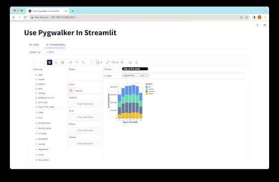
3. Stacked Bar Chart: This chart shows data as stacked bars. It is best used when you want to show the relationship between parts and the whole.
4. Grouped Bar Chart: This chart shows data as separate bars for each category. It is best used when you want to compare data between different categories.
Now that we have discussed the different types of bar charts, let's talk about when to use a bar chart. Bar charts are best used when you want to show discrete data, that is, data with distinct categories. They are also an excellent choice when you want to compare data between categories. However, they are not the best choice when you want to show trends or continuous data.
In conclusion, making a bar chart is a simple and effective way to represent data visually. With the right software program and a little creativity, you can create a chart that is easy to understand and aesthetically pleasing. Before creating your chart, make sure that you choose the right type of chart and that your data is relevant and easy to understand. With a little effort, you can create a bar chart that effectively communicates your data to others.

Comments
Post a Comment