Data Visualization Examples: Enhancing Data Interpretation and Communication
Data Visualization Examples: Enhancing Data Interpretation and Communication
Data visualization is an important tool in modern data analytics as it provides a concise and clear representation of data that can be easily interpreted and communicated. With the increasing data volume and complexity today, data visualization helps people quickly understand the data they need to make informed decisions. In this article, we explore data visualization examples which showcase the power of effective data visualization in improving data interpretation and communication.
1. Infographics
Infographics are one of the commonly used data visualization examples. They are used to represent complex data in a visually appealing and simple way. Infographics often include charts, diagrams, and icons that help people quickly understand the data presented. For instance, an infographic could be created to show the different types of cancer, their prevalence, and risk factors. This helps people gain a better understanding of the broader impact of cancer, and how they can prevent it.
2. Heat maps
Heat maps are a data visualization example that provides a geographic representation of data. They show the density of data points within a specific area, with shaded colors that correspond to the data value. Heat maps are useful in identifying patterns or trends in data points that are distributed across a given region. For example, heat maps might be used to display the frequency with which different crimes occur across a city.
3. Line charts
Line charts are commonly used to display data over time. Line charts show trends, such as an increase or decrease in data values, or when one variable changes while the other remains constant. Line charts also make it easy to see the correlation between different data values. For instance, line charts might be used to show the rate at which a company's revenue grows over time.
4. Bar charts
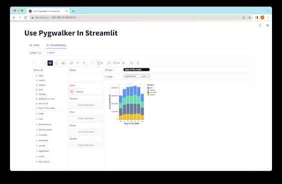
Like line charts, bar charts are often used to compare different data sets. Bar charts, however, represent data in columns with a height proportional to the data value. Bar charts can be used to compare different categories of data, such as different products within a company or different countries’ energy consumption.
5. Scatter plots
Scatter plots are used to display correlations between two variables. The data values are plotted on a graph with one variable shown on the x-axis and the other variable on the y-axis. This allows for the identification of trends, such as a positive or negative correlation between data sets. Scatter plots might be used to display the correlation between the price of a product and its profitability.
6. Tree maps
Tree maps are data visualization examples which are used to show hierarchical data. Each category is represented by a rectangle, and the size of the rectangle corresponds to the data value. The most significant categories are larger rectangles while the less significant ones are displayed in smaller rectangles. Tree maps might be used to show the allocation of a company's budget across different departments.
7. Choropleth maps
Choropleth maps are similar to heat maps but represent data based on specific geographic boundaries such as countries or states. The data value is represented by a color, which varies based on the data value. For example, a choropleth map might be used to display the prevalence of obesity nationwide.
Conclusion
Data visualization examples help enhance the value of data for better interpretation and communication. The use of visuals in communicating data makes it appealing, concise, and easy to comprehend for all types of audiences. The above-mentioned examples of data visualization show how to accurately and efficiently represent complex data in a way that makes it easier to understand and interpret. In essence, data visualization is the art of interpreting and communicating data in a more meaningful way.
You can more information on data visualization examples here.

Comments
Post a Comment